Don't leave users hungry for more
A case study on how to improve your customer's experience when it comes to waiting for their delivery meal
Bad user experience can not only break your user's journey but also break their trust in your product.
This could be a technical issue that is out of the designer’s control or a feature that is still being developed. Regardless, the user’s experience should still be prioritized.
Hungry customers = bad reviews
In the food delivery industry, we deal with a lot of hungry customers. Hungry people are more prone to frustration and anger when our service doesn't meet their expectations. Disappointed users leave bad reviews.
What does it take to get a good review? Once a user confirms their order, the countdown begins. Consumers are satisfied with their delivery when they receive their order by the estimated time of arrival (ETA).
But what if external factors, such as a delayed response from the restaurant or bad driving conditions, influence the order? What can we do to ensure that the user forgives (or forgets) a negative experience?
The goal
As a UX Writer at Just Eat Takeaway, my focus is to ensure that our user has a pleasant journey while they wait for their order, even if the courier is late.
The challenge
Stakeholders did not want to make technical changes to the current state of the app. I needed to improve the experience without adding new functionalities (e.g. live tracking).
The current experience
After the user has confirmed their order, they arrive at a screen that shows an ETA, their order status, and a map.
If the user selected a delivery time, it will say, for example, "Pre-ordered at 17.30." Otherwise, the default status is "As soon as possible."
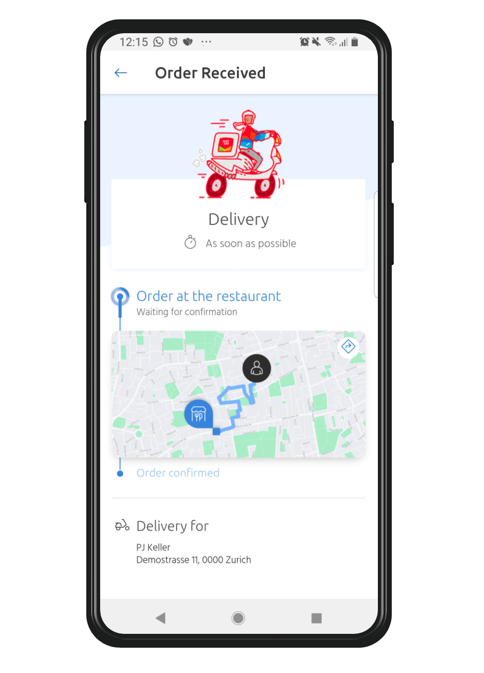
ALT TEXT: Order received. Delivery: as soon as possible. Order at the restaurant: waiting for confirmation. Delivery for: PJ Keller, Demostrasse 11, 0000 Zürich.
"I live next to a lake and I didn't see the lake on the map. I panicked because I thought I had put in the wrong location!"
What this section does not tell the user
What time the order made. While there is an ETA, the screen doesn't show when the user placed their order. This makes it difficult for them to gauge when their order will arrive since they don't know how much time has passed. (Also, we're forcing the user to do the math themselves, which is quite rude when they're hungry.)
When the courier picked up the order. It would be very useful and reassuring to the user to know the exact time this action took place. But, since the page is static, it would not be possible to display this information without having to update the page.
The current location of the order. While there is a map on the screen, it is a default map and doesn't display the order's live location. This has created confusion and even panic for some users. One user described, "I live next to a lake and I didn't see the lake on the map. I panicked because I thought I had put in the wrong location!"
Pain points and how to improve them
Through desk research, I compiled data based on real reviews from Just Eat Switzerland customers.
Delivery times are vague, inaccurate, or not displayed. The user already knows that every order is being prepared "as soon as possible," so this isn't helpful. An actual ETA would be better. Updating the ETA on the screen (like a countdown) allows users to see that their order is moving forward.
Live-tracking does not work. The static map is misleading users into thinking that they are able to track their order. Not only is it confusing, but it has also caused some users to panic. Until a live-tracking is available, it's best to remove the map altogether.
Tracking the courier is possible, but on an external app via SMS. One user wished that the entire experience could be within one app. Another user has their SMS notifications turned off so they didn't know about the feature. We could resolve this with automatic page refreshes every time there is a status change.
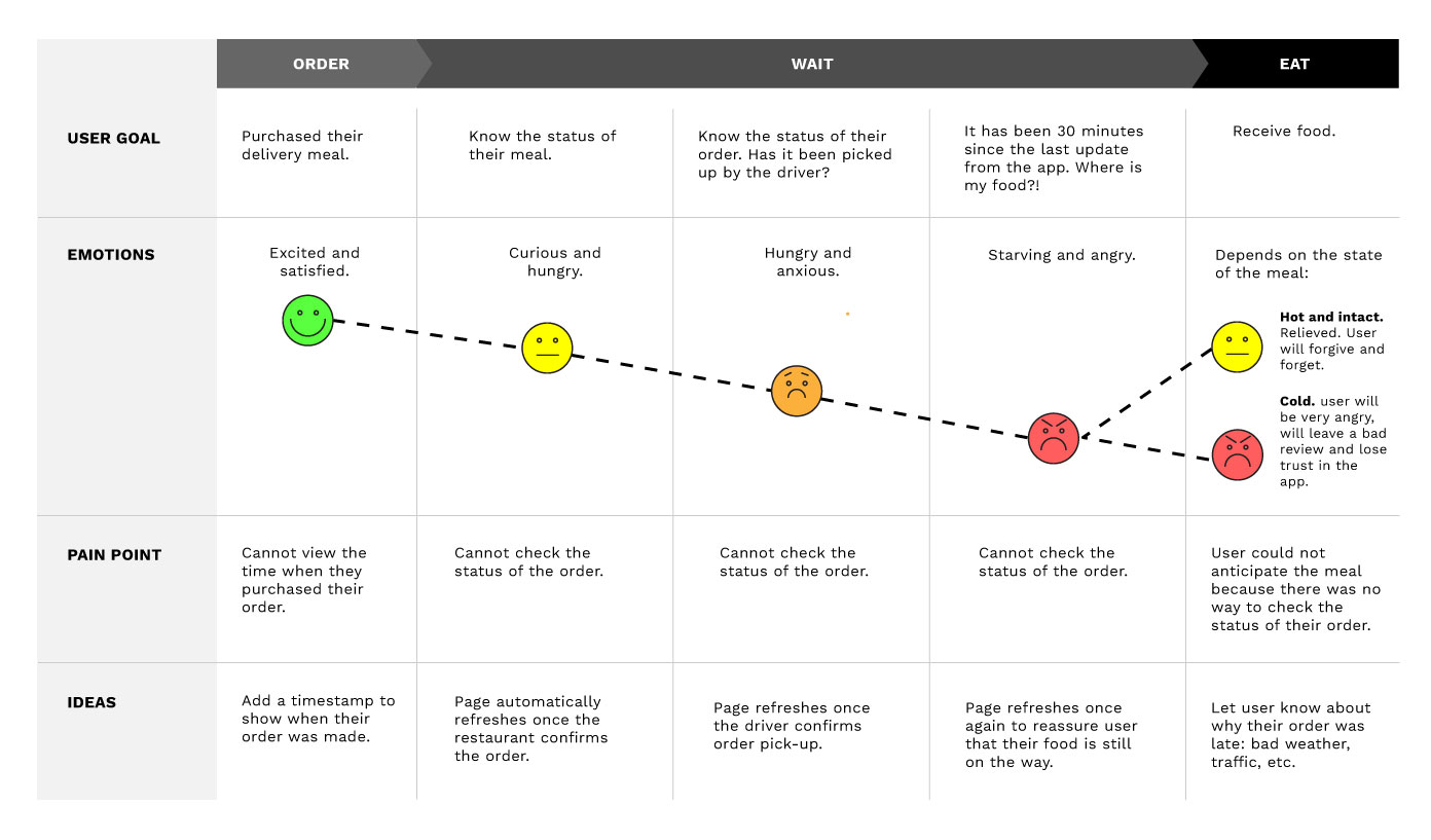
The user journey map shows how a lack of information from our end can affect their experience. Their mood starts to decline the longer they need to wait with no way of finding out what's going on with their order.
The after-order journey is one of the last touchpoints the user has with our brand. Is this how we want to be remembered?
Improving
the journey
1. Thank you! Your meal is coming right up.
Once the user places their order, they arrive at the "Thank you" page. Here, the countdown begins. A timestamp shows when the order was placed. The text below indicates the next step: "Now waiting for restaurant confirmation."
In the green text, we reassure the user that updates will occur on this screen. The page will refresh when there is a change in their order.
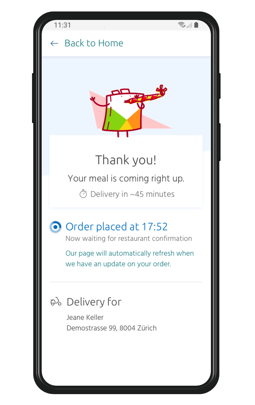
ALT TEXT: Thank you! Your meal is coming right up. Delivery in 45 minutes. Order placed at 17:52. Now waiting for restaurant confirmation. Our page will automatically refresh when we have an update on your order. Delivery for: Jeane Keller, Demostrasse 99, 8004 Zürich.
2. Ding ding! Information received.
The timeline is now visibly active. The user can see that their order was confirmed at 17:54 and is being prepared.
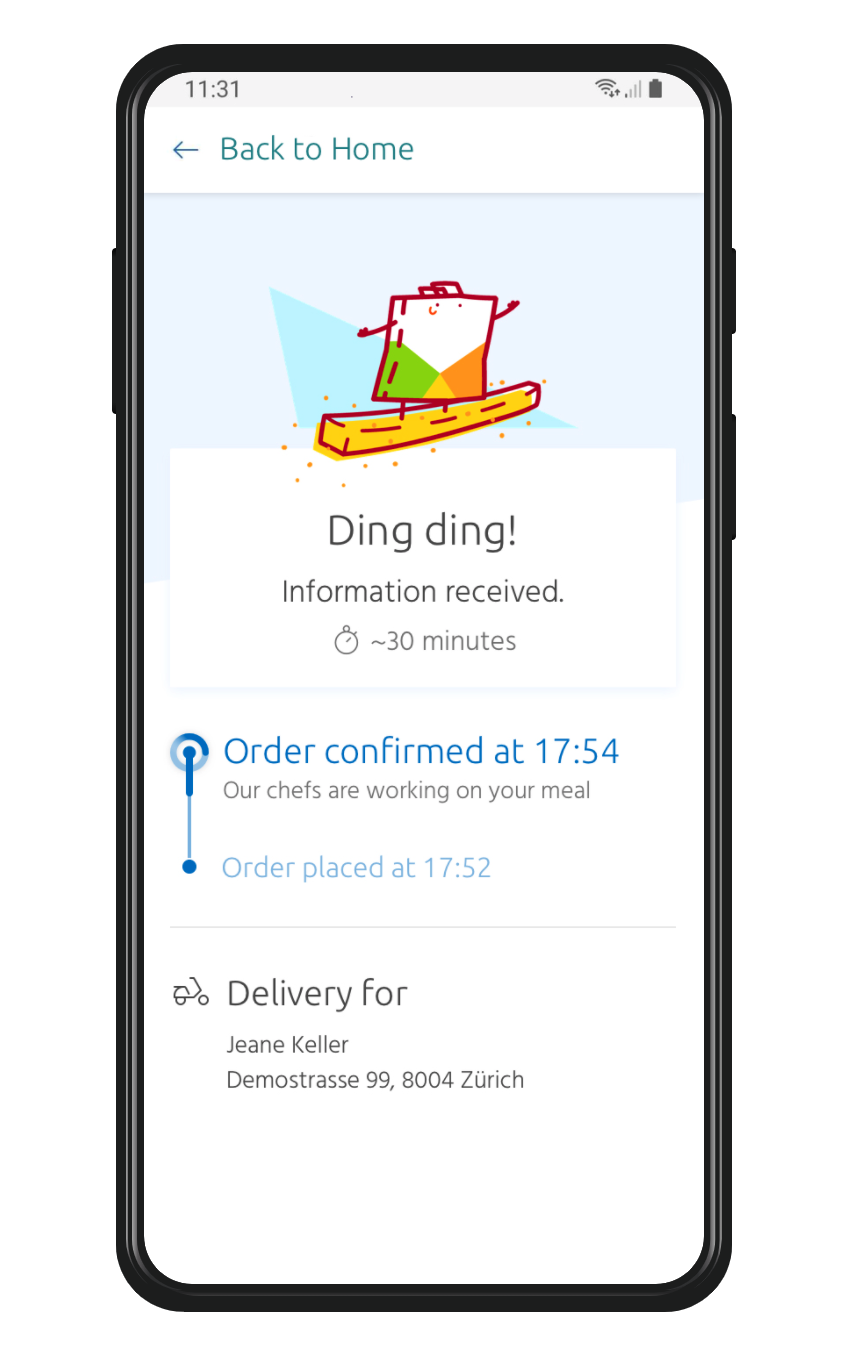
ALT TEXT: Ding ding! Information received. Estimated time of arrival is 30 minutes. Order confirmed at 17:54. Our chefs are working on your meal. Order placed at 17:52.
3. We're on our way! Your dish is ready to go. 
This part of the journey will be the most anxious for the user. Now that they know that their order is on the way (and they are hungry), expectations are high.
At this point, all we can do is reassure the user. We let them know that there are forces outside of our control that could affect the ETA. "We are operating during peak hours, so please note that there may be a slight delay in delivery time."
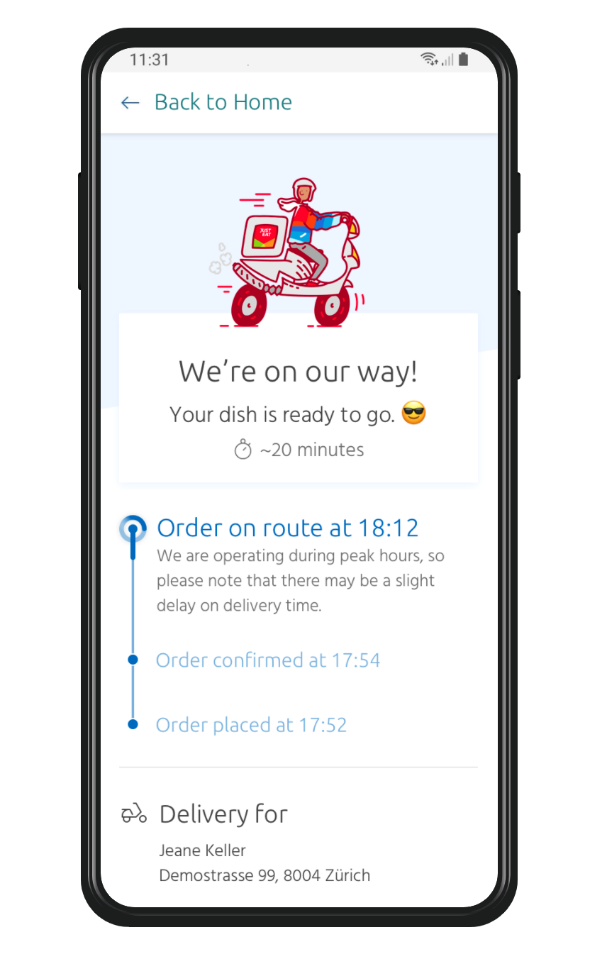
ALT TEXT: We're on our way! Your dish is ready to go. Estimated time of arrival is 20 minutes. Order on route at 18:12. We are operating during peak hours, so please note that there may be a slight delay in delivery time.
4. Almost there! I know! We can't wait either.
This may or may not be factual, but by this stage, the hungry and excited user is checking the page more often. The screen refreshes once again after the delivery time has reached its halfway point to show a slight update in status.
The timeline doesn't change on this screen, just the illustration and text. This is to reassure the user that their order is still in progress.
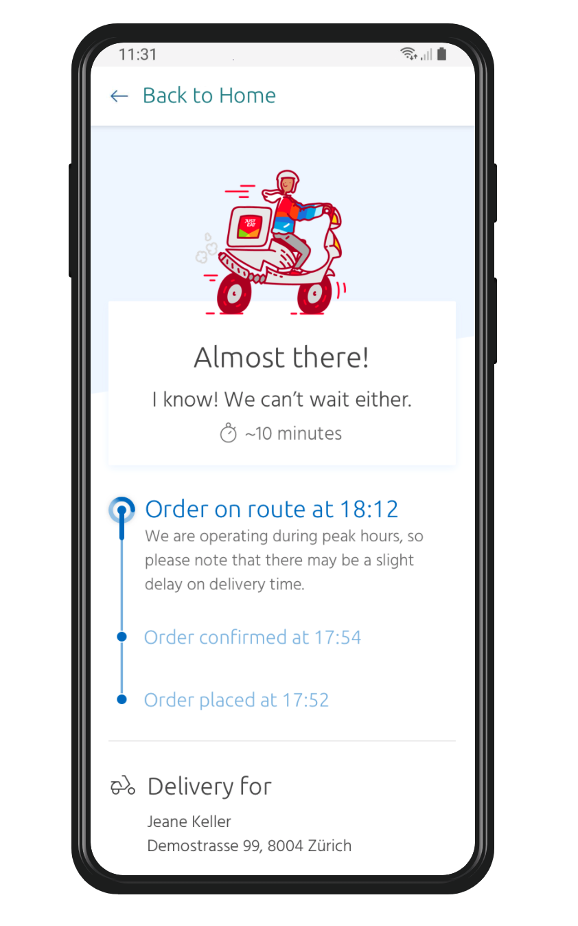
ALT TEXT: Almost there! I know, we can't wait either. Estimated time of arrival is 10 minutes. Order on route at 18:12. We are operating during peak hours, so please note that there may be a slight delay in delivery time.
5. We're here! Enjoy your meal.
Once the courier has reached their destination, the screen changes to the final step. The arrival time is shown, the order is complete, and hopefully, our user is happy!
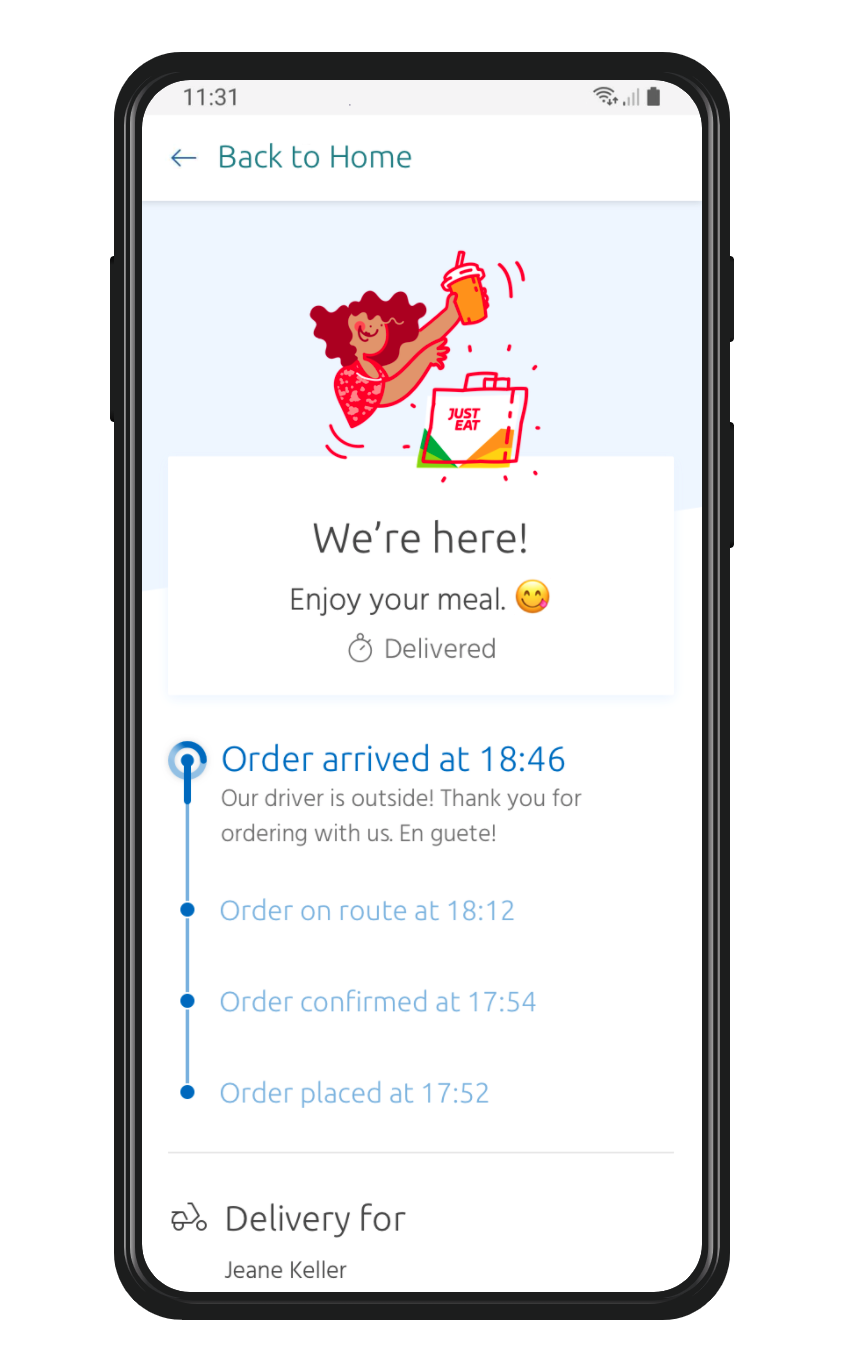
ALT TEXT: We're here! Enjoy your meal. Status: delivered. Order arrived at 18:46. Our driver is outside! Thank you for ordering with us. En guete!
Conclusion
Reassurance is key to a good experience
Based on user reviews and feedback, I learned that a hungry user craves reassurance. If live tracking was possible, then the user has access to the information they need.
If it's not possible, then we need to do our best to reassure the user that their order is on its way. That's really all they want to know.
And if their order doesn't arrive? Well, that's for another case study.
All illustrations are copyright of Just Eat Group
